Why checking the digits isn't enough before packaging goes to print
A barcode can carry the right information and still fail to scan, or scan poorly.
A quick artwork check usually confirms that the barcode is present, that the number underneath matches the agreed value, that the check digit is correct, and that the code hasn't been swapped by mistake.
But a scanner doesn't read the digits printed below the bars. It reads a sequence of dark and light elements, their width, the spacing, the contrast, the geometry.
Checking the data and checking the readability are two separate jobs.
What a barcode check actually covers
First comes the data itself: does the encoded value match the agreed product number, is the barcode type correct for the job, is the check digit valid, does the human-readable number match what's actually encoded, did the value change during an image swap or a re-export of the PDF.
This check answers one question: is the right data encoded in the barcode? It doesn't answer the second one: will a scanner actually read this barcode off the packaging?
A correct number doesn't guarantee a scannable code
A few situations worth walking through.
Situation 1: correct number, weak contrast. The digits and the encoded value are right, but the bars are printed in light blue on a white background. On screen the barcode can look contrasted enough. In practice, the difference between bars and background isn't enough for reliable scanning.
Situation 2: correct number, dark background. Black bars sit on a dark blue panel. The bar color itself is fine, but the background doesn't allow the contrast the code needs.
Situation 3: correct number, quiet zone violated. A frame, a line, text, or a decorative element runs close to the barcode. If it enters the quiet zone, the scanner can misread where the code starts and ends.
Situation 4: correct number, distorted geometry. The barcode was stretched horizontally or vertically, scaled down past the safe limit, or exported at too low a resolution. The bar widths no longer match the calculated geometry.
The checks that matter
| Check | What it answers | Example of failure |
|---|---|---|
| Encoded value | Is the right number stored in the code? | Wrong product number used |
| Check digit | Is the code mathematically valid? | Invalid last digit on an EAN |
| Human-readable number | Does the printed number match what's encoded? | PDF shows one value, code holds another |
| Contrast | Are bars and background different enough? | Light blue bars on white |
| Polarity | Are the bars darker than the background? | White bars on dark blue |
| Quiet zone | Is the clear space around the code intact? | A frame enters the left margin |
| Size and geometry | Is the code too small or distorted? | Non-proportional stretching |
| Physical sample | Does the printed result scan? | Ink spread changed the bar widths |
Contrast matters more than the color's name
A barcode doesn't have to be black, and the background doesn't have to be white.
A dark navy Pantone on a light beige background can work. So can dark green on pale yellow, or dark brown on a light packaging substrate.
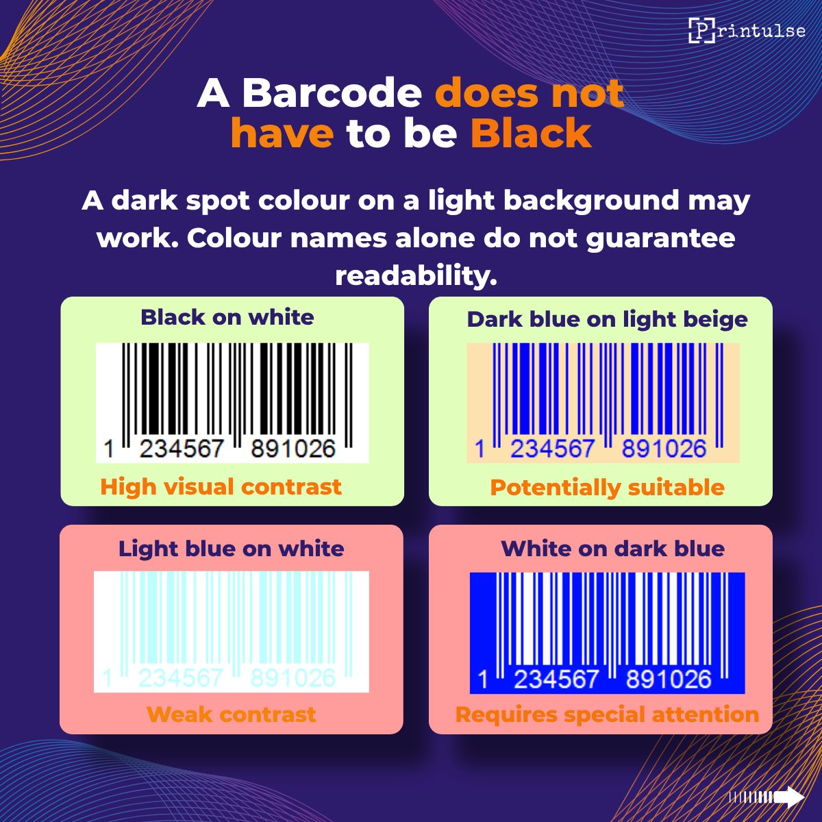
But the name of the color guarantees nothing on its own. What matters is the actual difference between bars and background, the optical properties of the ink, the substrate, the print method, the barcode's size, dot gain, registration, the condition of the finished print.
"The barcode is correct because it isn't black" is not a safe conclusion. Color has to be judged against the background and the print process together, never on its own.
Polarity: dark on light
Contrast and polarity are related but not the same thing. Contrast shows how much the bars differ from the background. Polarity shows which one is darker, the bars or the background.
For a standard linear barcode, the safe setup is dark bars on a light background. The risky one is light bars on a dark panel.
Even when the contrast looks strong on screen, reverse polarity can cause unreliable scans or fail on scanners that aren't built to handle it. Visible contrast in the artwork isn't enough to call reverse polarity safe by default.
The quiet zone around a barcode
The quiet zone is the clear space around a barcode that has to stay free of anything else: frames, lines, text, logos, images, decorative patterns, gradients, other barcodes, background elements with strong contrast.
Keeping that space clear on the left and right of a linear barcode matters most. A QR code needs it on all four sides.
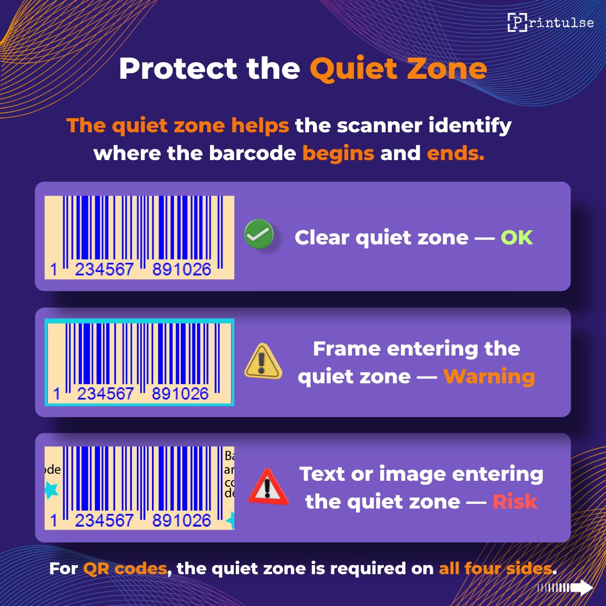
A scanner has to work out where the code starts, where it ends, which elements are bars, and where the background begins. If the design crowds the code, the scanner can miss the edges or pick up signals it shouldn't.
Size and geometry
Even a well-contrasted barcode can become a problem if it was scaled incorrectly.
Before print, check:
- the actual width and height
- that the code was not stretched out of proportion
- the minimum width of the thinnest element
- that the size still meets the requirements for that specific symbology
- that it was not reduced past a safe limit
- that resolution is sufficient if the barcode sits as a raster object
- that export did not introduce any blur
- that the code does not deform on a curved surface
A barcode can't be scaled down along with everything else on the layout and assumed to still work.
What changes in print
On screen, a barcode is made of perfectly sharp geometric elements. In print, its appearance and readability are shaped by dot gain, pressure, press speed, plate quality, print resolution, ink misregistration, the condition of the anilox roll, how the ink absorbs or spreads, substrate roughness, whether the film is transparent or metallized, lamination applied afterward, varnish or protective coating, and the curve of the finished package.
This matters especially in flexography. Thin elements can get wider, narrow gaps can get tighter. On a small barcode, even a minor shift in geometry can affect the result.
PDF check and print check
Neither replaces the other.
An artwork check can confirm whether the encoded value is correct, whether the digits match the content, whether the barcode is present, whether the quiet zone is sufficient, whether the code is too small, whether polarity is correct, whether contrast holds up both visually and technically, and whether anything overlaps the code.
A physical sample check shows whether the geometry survived printing, whether widths and spacing shifted, whether dot gain played a role, whether the code scans on the actual equipment, whether it works on the finished package, and whether lamination or varnish degraded the result.
The safest process runs through several stages:
- Data check
- Artwork check
- Visual proof check
- Printed sample check
- Verifier or scanner check
Each stage answers a different question.
Why one phone isn't enough
A smartphone scan is a useful quick test, but it isn't a full quality check. Phones use more advanced image processing, correct perspective automatically, boost local contrast, and often read borderline codes that other equipment wouldn't. Results vary by camera and app.
A code reading fine on one phone doesn't mean it will scan reliably at a checkout, in a warehouse, or on a production line.
For critical products, the safer route is checking a physical sample with a proper verifier or with the equipment actually used downstream.
Checklist before approving the artwork
Data. Encoded value matches the agreed number. Barcode type matches the job. Check digit is valid. Human-readable number matches the encoded content. No accidental change in a new artwork version.
Contrast and color. Bars are clearly darker than the background. Background is light enough. No light barcode on a dark panel without specific confirmation. Color checked against substrate and print method. No complex image or uneven background behind the code.
Geometry. Size meets requirements. Code isn't stretched out of proportion. Thin elements aren't too small. Raster object has enough resolution. Code doesn't deform due to package shape.
Quiet zone. Nothing else sits to the left or right of a linear code. A QR code keeps clear space on all sides. Frames and decorative lines stay out of the quiet zone. No other barcode or high-contrast image nearby.
Production. Dot gain accounted for. Registration checked. Substrate accounted for. Varnish, lamination or other finishing accounted for. Physical sample checked. Verifier used where needed.
The bottom line
Checking the digits under a barcode is necessary, but it only covers the data.
A full check needs two separate answers: is the number encoded correctly, and will the equipment scan the printed barcode reliably.
A barcode doesn't have to be black, and the background doesn't have to be white. But dark elements need enough contrast against a light background, the quiet zone has to stay clear, and the final judgment has to account for the actual print and substrate.
A correct number doesn't guarantee a scannable barcode.
Take the carousel with you
All eight slides in one PDF, in English. Free to download. PDF · 3.5 MB
Download PDFSources: GS1 General Specifications, GS1 AISBL (gs1.org) · GS1 Italy, barcode verification report sample (gs1it.org)